
툴팁
툴팁 (Tooltip)
마우스를 올렸을 때 간단한 설명 텍스트를 띄워주는 컴포넌트입니다. HTML title 속성 대신 주로 사용돼요.
출처: 문서
본문
언제 사용하나요 (When To Use)
- 마우스를 올리면 팁이 표시되고, 떼면 숨겨집니다. Tooltip은 복잡한 텍스트나 동작을 지원하지 않습니다.
button/text/operation의 설명을 제공할 때. HTMLtitle속성 대신 자주 사용됩니다.
예제 (Examples)
기본 (Basic)
가장 간단한 사용법입니다.
import React from 'react';
import { Tooltip } from 'antd';

const App: React.FC = () => (
  <Tooltip title="prompt text">
    <span>Tooltip will show on mouse enter.</span>
  </Tooltip>
);

export default App;
부드러운 전환 (Smooth Transition)
ConfigProvider 전역 설정을 통해 한 번에 하나의 Tooltip만 표시되도록 해 부드러운 전환 효과를 구현합니다.
import React from 'react';
import { Button, ConfigProvider, Flex, Tooltip } from 'antd';

const SharedButton = ({ placement = 'top' }: { placement?: 'top' | 'bottom' }) => (
  <Tooltip title="Hello, Ant Design!" placement={placement}>
    <Button type="primary">Button</Button>
  </Tooltip>
);

const App: React.FC = () => {
  return (
    <ConfigProvider
      tooltip={{
        unique: true,
      }}
    >
      <Flex vertical gap="small">
        <Flex gap="small" justify="center">
          <SharedButton />
          <SharedButton />
        </Flex>
        <Flex gap="small" justify="center">
          <SharedButton placement="bottom" />
          <SharedButton placement="bottom" />
        </Flex>
      </Flex>
    </ConfigProvider>
  );
};

export default App;
배치 (Placement)
12가지 배치 옵션을 지원합니다.
import React from 'react';
import { Button, ConfigProvider, Flex, Tooltip } from 'antd';

const text = <span>prompt text</span>;

const buttonWidth = 80;

const App: React.FC = () => (
  <ConfigProvider button={{ style: { width: buttonWidth, margin: 4 } }}>
    <Flex vertical justify="center" align="center" className="demo">
      <Flex justify="center" align="center" style={{ whiteSpace: 'nowrap' }}>
        <Tooltip placement="topLeft" title={text}>
          <Button>TL</Button>
        </Tooltip>
        <Tooltip placement="top" title={text}>
          <Button>Top</Button>
        </Tooltip>
        <Tooltip placement="topRight" title={text}>
          <Button>TR</Button>
        </Tooltip>
      </Flex>
      <Flex style={{ width: buttonWidth * 5 + 32 }} justify="space-between" align="center">
        <Flex align="center" vertical>
          <Tooltip placement="leftTop" title={text}>
            <Button>LT</Button>
          </Tooltip>
          <Tooltip placement="left" title={text}>
            <Button>Left</Button>
          </Tooltip>
          <Tooltip placement="leftBottom" title={text}>
            <Button>LB</Button>
          </Tooltip>
        </Flex>
        <Flex align="center" vertical>
          <Tooltip placement="rightTop" title={text}>
            <Button>RT</Button>
          </Tooltip>
          <Tooltip placement="right" title={text}>
            <Button>Right</Button>
          </Tooltip>
          <Tooltip placement="rightBottom" title={text}>
            <Button>RB</Button>
          </Tooltip>
        </Flex>
      </Flex>
      <Flex justify="center" align="center" style={{ whiteSpace: 'nowrap' }}>
        <Tooltip placement="bottomLeft" title={text}>
          <Button>BL</Button>
        </Tooltip>
        <Tooltip placement="bottom" title={text}>
          <Button>Bottom</Button>
        </Tooltip>
        <Tooltip placement="bottomRight" title={text}>
          <Button>BR</Button>
        </Tooltip>
      </Flex>
    </Flex>
  </ConfigProvider>
);

export default App;
화살표 (Arrow)
화살표 표시, 숨김, 중앙 유지를 지원합니다.
import React, { useMemo, useState } from 'react';
import { Button, ConfigProvider, Flex, Segmented, Tooltip } from 'antd';
import type { TooltipProps } from 'antd';

const text = <span>prompt text</span>;

const buttonWidth = 80;

const App: React.FC = () => {
  const [arrow, setArrow] = useState<'Show' | 'Hide' | 'Center'>('Show');

  const mergedArrow = useMemo<TooltipProps['arrow']>(() => {
    if (arrow === 'Hide') {
      return false;
    }

    if (arrow === 'Show') {
      return true;
    }

    return {
      pointAtCenter: true,
    };
  }, [arrow]);

  return (
    <ConfigProvider button={{ style: { width: buttonWidth, margin: 4 } }}>
      <Segmented
        value={arrow}
        options={['Show', 'Hide', 'Center']}
        onChange={setArrow}
        style={{ marginBottom: 24 }}
      />
      <Flex vertical justify="center" align="center" className="demo">
        <Flex justify="center" align="center" style={{ whiteSpace: 'nowrap' }}>
          <Tooltip placement="topLeft" title={text} arrow={mergedArrow}>
            <Button>TL</Button>
          </Tooltip>
          <Tooltip placement="top" title={text} arrow={mergedArrow}>
            <Button>Top</Button>
          </Tooltip>
          <Tooltip placement="topRight" title={text} arrow={mergedArrow}>
            <Button>TR</Button>
          </Tooltip>
        </Flex>
        <Flex style={{ width: buttonWidth * 5 + 32 }} justify="space-between" align="center">
          <Flex align="center" vertical>
            <Tooltip placement="leftTop" title={text} arrow={mergedArrow}>
              <Button>LT</Button>
            </Tooltip>
            <Tooltip placement="left" title={text} arrow={mergedArrow}>
              <Button>Left</Button>
            </Tooltip>
            <Tooltip placement="leftBottom" title={text} arrow={mergedArrow}>
              <Button>LB</Button>
            </Tooltip>
          </Flex>
          <Flex align="center" vertical>
            <Tooltip placement="rightTop" title={text} arrow={mergedArrow}>
              <Button>RT</Button>
            </Tooltip>
            <Tooltip placement="right" title={text} arrow={mergedArrow}>
              <Button>Right</Button>
            </Tooltip>
            <Tooltip placement="rightBottom" title={text} arrow={mergedArrow}>
              <Button>RB</Button>
            </Tooltip>
          </Flex>
        </Flex>
        <Flex justify="center" align="center" style={{ whiteSpace: 'nowrap' }}>
          <Tooltip placement="bottomLeft" title={text} arrow={mergedArrow}>
            <Button>BL</Button>
          </Tooltip>
          <Tooltip placement="bottom" title={text} arrow={mergedArrow}>
            <Button>Bottom</Button>
          </Tooltip>
          <Tooltip placement="bottomRight" title={text} arrow={mergedArrow}>
            <Button>BR</Button>
          </Tooltip>
        </Flex>
      </Flex>
    </ConfigProvider>
  );
};

export default App;
자동 이동 (Auto Shift)
Tooltip이 화면 가장자리에 가까워지면 팝업과 화살표 위치를 자동으로 조정합니다. 한계를 초과하면 화면 밖으로 나갈 수 있습니다.
import React from 'react';
import { Button, Tooltip } from 'antd';

const style: React.CSSProperties = {
  width: '300vw',
  height: '300vh',
  display: 'flex',
  alignItems: 'center',
  justifyContent: 'center',
};

const App: React.FC = () => {
  React.useEffect(() => {
    document.documentElement.scrollTop = document.documentElement.clientHeight;
    document.documentElement.scrollLeft = document.documentElement.clientWidth;
  }, []);
  return (
    <div style={style}>
      <Tooltip title="Thanks for using antd. Have a nice day !" open>
        <Button type="primary">Scroll The Window</Button>
      </Tooltip>
    </div>
  );
};

export default App;
레이아웃 변경 후 재정렬 (Realign after layout changes)
import React from 'react';
import type { TooltipRef } from 'antd';
import { Button, Tooltip } from 'antd';

const App: React.FC = () => {
  const [loaded, setLoaded] = React.useState(false);
  const tooltipRef = React.useRef<TooltipRef>(null);

  React.useEffect(() => {
    const timer = window.setTimeout(() => {
      setLoaded(true);
    }, 2000);

    return () => window.clearTimeout(timer);
  }, []);

  React.useLayoutEffect(() => {
    if (loaded) {
      tooltipRef.current?.forceAlign();
    }
  }, [loaded]);

  return (
    <div style={{ minHeight: 160, paddingTop: 16 }}>
      {loaded && <div style={{ height: 80, marginBottom: 16 }}>Async content loaded.</div>}
      <Tooltip ref={tooltipRef} title="Tooltip stays aligned" open placement="top">
        <Button>Trigger</Button>
      </Tooltip>
    </div>
  );
};

export default App;
컬러풀한 Tooltip (Colorful Tooltip)
다양한 상황에 쓸 수 있도록 일련의 컬러풀한 Tooltip 스타일을 미리 정의했습니다.
import React from 'react';
import { Button, Divider, Space, Tooltip } from 'antd';

const colors = [
  'pink',
  'red',
  'yellow',
  'orange',
  'cyan',
  'green',
  'blue',
  'purple',
  'geekblue',
  'magenta',
  'volcano',
  'gold',
  'lime',
];

const customColors = ['#f50', '#2db7f5', '#87d068', '#108ee9'];

const App: React.FC = () => (
  <>
    <Divider titlePlacement="start">Presets</Divider>
    <Space wrap>
      {colors.map((color) => (
        <Tooltip title="prompt text" color={color} key={color}>
          <Button>{color}</Button>
        </Tooltip>
      ))}
    </Space>
    <Divider titlePlacement="start">Custom</Divider>
    <Space wrap>
      {customColors.map((color) => (
        <Tooltip title="prompt text" color={color} key={color}>
          <Button>{color}</Button>
        </Tooltip>
      ))}
    </Space>
  </>
);

export default App;
비활성화 (Disabled)
title={null} 또는 title=""로 Tooltip을 비활성화할 수 있습니다.
import React, { useState } from 'react';
import { Button, Tooltip } from 'antd';

const App: React.FC = () => {
  const [disabled, setDisabled] = useState(true);

  return (
    <Tooltip title={disabled ? null : 'prompt text'}>
      <Button onClick={() => setDisabled(!disabled)}>{disabled ? 'Enable' : 'Disable'}</Button>
    </Tooltip>
  );
};

export default App;
커스텀 컴포넌트 감싸기 (Wrap custom component)
커스텀 컴포넌트와 함께 사용합니다.
import React from 'react';
import { Tooltip } from 'antd';

const ComponentWithEvents = React.forwardRef<HTMLSpanElement, React.HTMLAttributes<HTMLElement>>(
  (props, ref) => (
    <span ref={ref} {...props}>
      This text is inside a component with the necessary events exposed.
    </span>
  ),
);

const App: React.FC = () => (
  <Tooltip title="prompt text">
    <ComponentWithEvents />
  </Tooltip>
);

export default App;
커스텀 시맨틱 DOM 스타일링 (Custom semantic dom styling)
classNames와 styles에 객체 또는 함수를 넘겨서 Tooltip의 시맨틱 DOM 스타일을 커스터마이즈할 수 있습니다.
import React from 'react';
import { Button, Flex, Tooltip } from 'antd';
import type { GetProp, TooltipProps } from 'antd';
import { createStaticStyles } from 'antd-style';

const classNames = createStaticStyles(({ css }) => ({
  container: css`
    padding: 10px;
  `,
}));

const styles: TooltipProps['styles'] = {
  container: {
    borderRadius: 12,
    boxShadow: 'inset 0 0 8px #ccc',
  },
};

const stylesFn: TooltipProps['styles'] = (info): GetProp<TooltipProps, 'styles', 'Return'> => {
  if (!info.props.arrow) {
    return {
      container: {
        backgroundColor: 'rgba(53, 71, 125, 0.8)',
        padding: 12,
        color: '#fff',
        borderRadius: 4,
      },
    };
  }
  return {};
};

const App: React.FC = () => {
  return (
    <Flex gap="medium">
      <Tooltip classNames={classNames} styles={styles} arrow={false} title="Object text">
        <Button>Object Style</Button>
      </Tooltip>
      <Tooltip classNames={classNames} styles={stylesFn} arrow={false} title="Function text">
        <Button type="primary">Function Style</Button>
      </Tooltip>
    </Flex>
  );
};

export default App;
API
Common props ref:Common props
| Property | Description | Type | Default | Version | Global Config |
|---|---|---|---|---|---|
| title | The text shown in the tooltip | ReactNode | () => ReactNode | - | - | × |
| color | The background color. After using this attribute, the internal text color will adapt automatically | string | - | 5.27.0 | × |
| classNames | Semantic DOM class | Record<SemanticDOM, string> | (info: { props }) => Record<SemanticDOM, string> | - | 5.23.0 | 5.23.0 |
| styles | Semantic DOM style | Record<SemanticDOM, CSSProperties> | (info: { props }) => Record<SemanticDOM, CSSProperties> | - | 5.23.0 | 5.23.0 |
공통 API (Common API)
ConfigProvider - tooltip.unique {#config-provider-tooltip-unique}
ConfigProvider를 통해 Tooltip의 전역 고유 표시를 구성할 수 있습니다. unique를 true로 설정하면 ConfigProvider 아래에서 한 번에 하나의 Tooltip만 표시되어 더 나은 사용자 경험과 부드러운 전환 효과를 제공합니다.
참고: 설정 후 getContainer, arrow 같은 속성은 무시됩니다.
import { Button, ConfigProvider, Space, Tooltip } from 'antd';

export default () => (
  <ConfigProvider
    tooltip={{
      unique: true,
    }}
  >
    <Space>
      <Tooltip title="First tooltip">
        <Button>Button 1</Button>
      </Tooltip>
      <Tooltip title="Second tooltip">
        <Button>Button 2</Button>
      </Tooltip>
    </Space>
  </ConfigProvider>
);
시맨틱 DOM (Semantic DOM)
https://ant.design/components/tooltip/semantic.md
디자인 토큰 (Design Token)
컴포넌트 토큰 (Component Token - Tooltip)
| Token Name | Description | Type | Default Value |
|---|---|---|---|
| maxWidth | Max width of tooltip | number | 250 |
| zIndexPopup | z-index of tooltip | number | 1070 |
글로벌 토큰 (Global Token)
| Token Name | Description | Type | Default Value |
|---|---|---|---|
| borderRadius | Border radius of base components | number | |
| borderRadiusXS | XS size border radius, used in some small border radius components, such as Segmented, Arrow and other components with small border radius. | number | |
| colorBgSpotlight | This color is used to draw the user's strong attention to the background color, and is currently only used in the background color of Tooltip. | string | |
| colorText | Default text color which comply with W3C standards, and this color is also the darkest neutral color. | string | |
| colorTextLightSolid | Control the highlight color of text with background color, such as the text in Primary Button components. | string | |
| controlHeight | The height of the basic controls such as buttons and input boxes in Ant Design | number | |
| fontFamily | The font family of Ant Design prioritizes the default interface font of the system, and provides a set of alternative font libraries that are suitable for screen display to maintain the readability and readability of the font under different platforms and browsers, reflecting the friendly, stable and professional characteristics. | string | |
| fontSize | The most widely used font size in the design system, from which the text gradient will be derived. | number | |
| lineHeight | Line height of text. | number | |
| motionDurationFast | Motion speed, fast speed. Used for small element animation interaction. | string | |
| motionDurationMid | Motion speed, medium speed. Used for medium element animation interaction. | string | |
| motionDurationSlow | Motion speed, slow speed. Used for large element animation interaction. | string | |
| motionEaseInOutCirc | Preset motion curve. | string | |
| motionEaseOutCirc | Preset motion curve. | string | |
| paddingSM | Control the small padding of the element. | number | |
| paddingXS | Control the extra small padding of the element. | number | |
| sizePopupArrow | The size of the component arrow | number |
FAQ
HOC가 가끔 동작하지 않는 이유는 무엇인가요? {#faq-hoc-component}
Tooltip의 자식 요소가 onMouseEnter, onMouseLeave, onPointerEnter, onPointerLeave, onFocus, onClick 이벤트를 받아들일 수 있어야 합니다.
https://github.com/ant-design/ant-design/issues/15909 를 참고하세요.
닫힐 때 Tooltip 콘텐츠가 업데이트되지 않는 이유는 무엇인가요? {#faq-content-not-update}
Tooltip은 콘텐츠가 업데이트될 때 깜빡임을 방지하기 위해 닫힐 때 콘텐츠를 캐시합니다:
// `title` will not blink when `user` is empty
<Tooltip open={user} title={user?.name} />
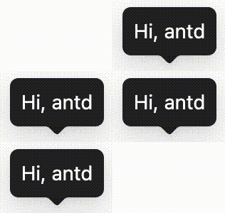
닫힐 때 콘텐츠를 업데이트해야 한다면 fresh 속성을 설정할 수 있습니다 (#44830):
<Tooltip open={user} title={user?.name} fresh />
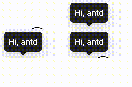
레이아웃 변경 후 Tooltip이 재정렬되지 않는 이유는 무엇인가요? {#faq-force-align}
Tooltip은 기본적으로 모든 외부 레이아웃 변경을 지속적으로 모니터링하지 않아 열려 있는 각 Tooltip의 추가 오버헤드를 피합니다. 비동기 데이터 로딩, 리스트 새로고침, 또는 영역 펼침·접기가 트리거 요소의 위치를 바꿀 때는 ref로 TooltipRef를 가져와 레이아웃 업데이트 후 forceAlign을 호출하세요 (#57809 참고). 완전한 예제는 위의 "레이아웃 변경 후 재정렬" 데모를 참고하세요.