
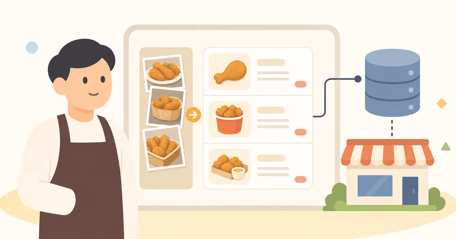
When the chicken franchise first reached out, all they had was a bundle of menu photos the store owners had been swapping over KakaoTalk and a vague ambition. Six weeks later, we handed over 6 logo variants, a menu database, 3 design mockups, and a live website.
The Start: A Single KakaoTalk Screenshot
1pro chicken is a small franchise based in Busan. Twelve stores, twenty menu items, and an average of three staff per store including the owner. They knew they needed a website, but when they got an outsourcing quote, the starting price was 6 million won with a separate monthly maintenance fee — roughly an entire month’s revenue for the store owners.
The CEO sent us a KakaoTalk screenshot of a menu photo collection and asked, “Can you somehow make this look nice?”
Week 1: Gap Analysis
Instead of a quote, we started with interviews. Three store owners, one person from headquarters, and two prospective franchisees. What we learned:
- Whenever the menu changes, store owners call headquarters to report it — photo updates take up to a week
- Prospective franchisees look at store locations and menu prices first
- Headquarters wants “brand consistency,” but the store owners want “to use photos of my own store”
We realized in the very first week that this wasn’t just about building a website — we had to redesign the flow of information between headquarters and the store owners.
— Mingyu Park, FE
Weeks 2–3: Building Brand Assets
Creating the logo took longer than expected. We started with two forms — emblem (a circular crest) and simple (an icon) — and ended up organizing 6 variants including vertical/horizontal and color/monochrome versions.
We organized the menu data in a Notion database. Nine chicken items, eleven sides. Each entry had 12 fields including name, price, calories, description, photo, allergy information, and per-store availability.
Week 4: Three Mockups
Because headquarters and the store owners disagreed, we presented 3 mockups:
- Sample 01 — Headquarters’ unified version. One main color, the brand font, store photos disabled
- Sample 02 — Store owners’ freedom version. Per-store photos exposed, headquarters guidelines minimized
- Sample 03 — The compromise. A headquarters brand header + a separate store-owner section
The final choice was Sample 03 — a structure that clearly separates the areas headquarters owns (brand, menu data) from the areas store owners own (store photos, business hours).
Weeks 5–6: Going Live with D-SKET
Because all the content was already in Notion, building the site with the D-SKET web builder took exactly 1 hour and 47 minutes — including domain connection, automatic SSL issuance, and auto-generation of per-store pages.
All we had to give the store owners was edit access to the Notion page. “To change a photo, just swap the image in Notion.” For headquarters, we provided a per-store activity dashboard.
Now
Two months after launch, the store owners’ average menu-photo update cycle dropped from one week → 1.5 days. Headquarters’ “please send me a photo” KakaoTalk messages have nearly vanished, too.
Franchise inquiries in the first month after launch were 3x the usual. The most-viewed pages were, as expected, “store locations” and “menu prices” — exactly what we’d heard in the interviews.