
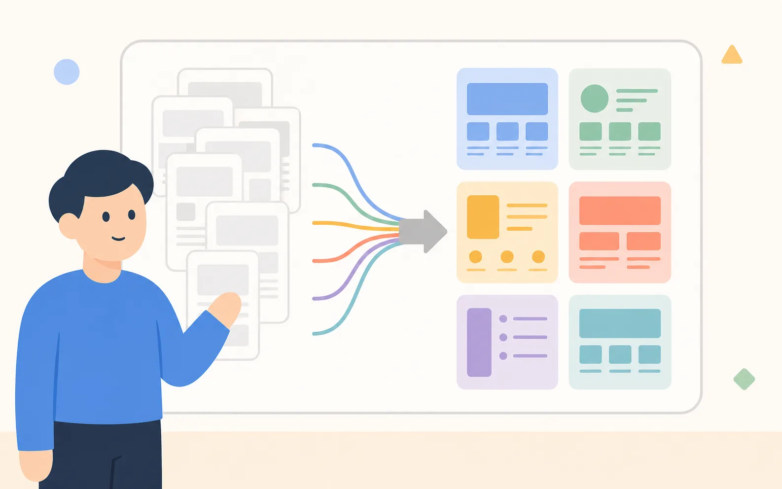
At first we thought 22 industries meant 22 designs. After building for six months, only 6 were truly different. The other 16 were just variations of those 6. What is genuinely different, and what is the same — here is the classification we discovered.
Law Firm vs. Magazine — Two Genuinely Different Things
A law-firm site is designed for “trust.” A magazine is designed for the “reading experience.” Look at how the two differ:
- Law is static — the information, once made, almost never changes. A magazine is flow — new content has to stream in every week.
- For law, credentials and certifications sit at the very top. For a magazine, the latest articles sit at the very top.
- Law uses few photos and a lot of black-and-white tone. For a magazine, big images are half the design.
Even starting from the same Notion page structure, the rendered result has to be fundamentally different. Same CMS, different paper.
Six Archetypes
Analyzing all 22, it ultimately comes down to 6:
- Authority — law, accounting, tax, medical. Centered on credentials, reviews, and booking consultations
- Storefront — restaurants, cafes, shops. Centered on location, menu, and business hours
- Showcase — studios, photographers, designers. Centered on a portfolio gallery
- Editorial — magazines, blogs, newsletters. Centered on regular content publishing
- Educator — instructors, coaches, academies. Centered on curriculum and enrollment
- Corporate — company intros, startups, B2B. Centered on team, services, and inquiries
The 22 industry categories are borrowed from the IRS standard, and the 6 archetypes are what we derived after observing usage patterns for six months. The same industry can map to a different archetype (e.g., a neighborhood lawyer is Authority, but a large law firm is closer to Corporate), and vice versa.
— Design Team
What’s the Same: Information Hierarchy
What all 6 archetypes share is the principle that “within 3 seconds you should know what this place does.” The first sentence of the hero area plays that role. No matter where the user came from (search, social, referral), the first screen has to give an answer.
One more thing: mobile first. Over 70% of users converting from Notion to a site first check their own site on mobile. So every template is designed to look good on mobile first.
What’s Different: The Shape of the CTA
For each archetype, what the user “should do next” is different:
- Authority → “Book a consultation” (a time-slot selection form)
- Storefront → “View on map” (naturally into directions)
- Showcase → “View project” (into work detail)
- Editorial → “Subscribe” (an email input)
- Educator → “Enroll” (course payment)
- Corporate → “Request a demo” (an inquiry form)
It’s the same CTA component, but the default action and form fields change depending on the archetype. The moment the user picks a template, that decision has already been made.